Side project · open resourceLive
AIspyMeet your new review team.
A full UX, UI and IA review from your AI crew.
AIspy is a free, open skill pack for Claude Code that reviews a website or app the way a senior designer would. It captures the pages, pulls out the brand, sends three independent agents through the product and hands you a report, an IA analysis and a mock of the fix.
1. Why AIspy
A senior review, without starting from a blank prompt.
A thorough UX, UI and IA (information architecture) review means capturing every page, studying the brand, benchmarking the market and arguing each finding. Ask an AI for a quick review instead, and you usually get a long list of generic issues with little evidence behind them.
AIspy packages the whole workflow into skills, templates and checks. It was built from a real professional review and tested against it: its research and findings at least match the reference, and its documents follow the same form. So every finding comes with its evidence and its reasoning, in documents styled in the product’s own brand.
It’s built for product managers, founders, developers and marketers who don’t have a senior designer to hand, and for designers and agent-led teams who want a full review to start from.
2. The team

One lead, three agents and a crew of pins.
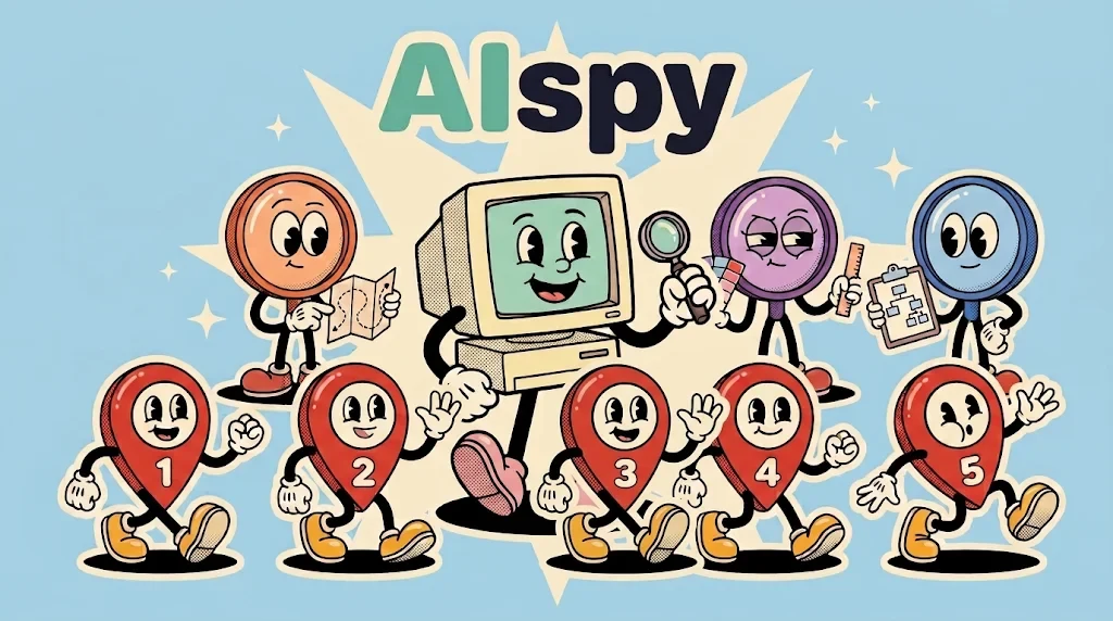
AIspy is the lead: your design director or product manager. It does the groundwork itself, directs three review agents that work separately so one can’t steer another, then collates what they find into the reports and the mock.

The lead · director
AIspy
Think of it as your design director or product manager. It captures the pages, extracts the brand and design system and runs the research, briefs the three agents and keeps the review on track, then collates their independent findings into the reports and the mock.

Agent · UX
The UX agent
Walks the key tasks the way a customer would, and notes where people hesitate, get lost or give up.
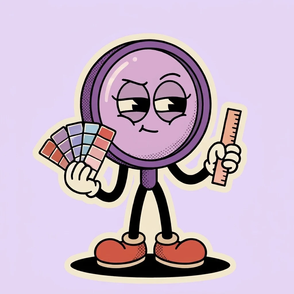
Agent · UI
The UI agent
Checks the details: hierarchy, type, colour, contrast, states and consistency.
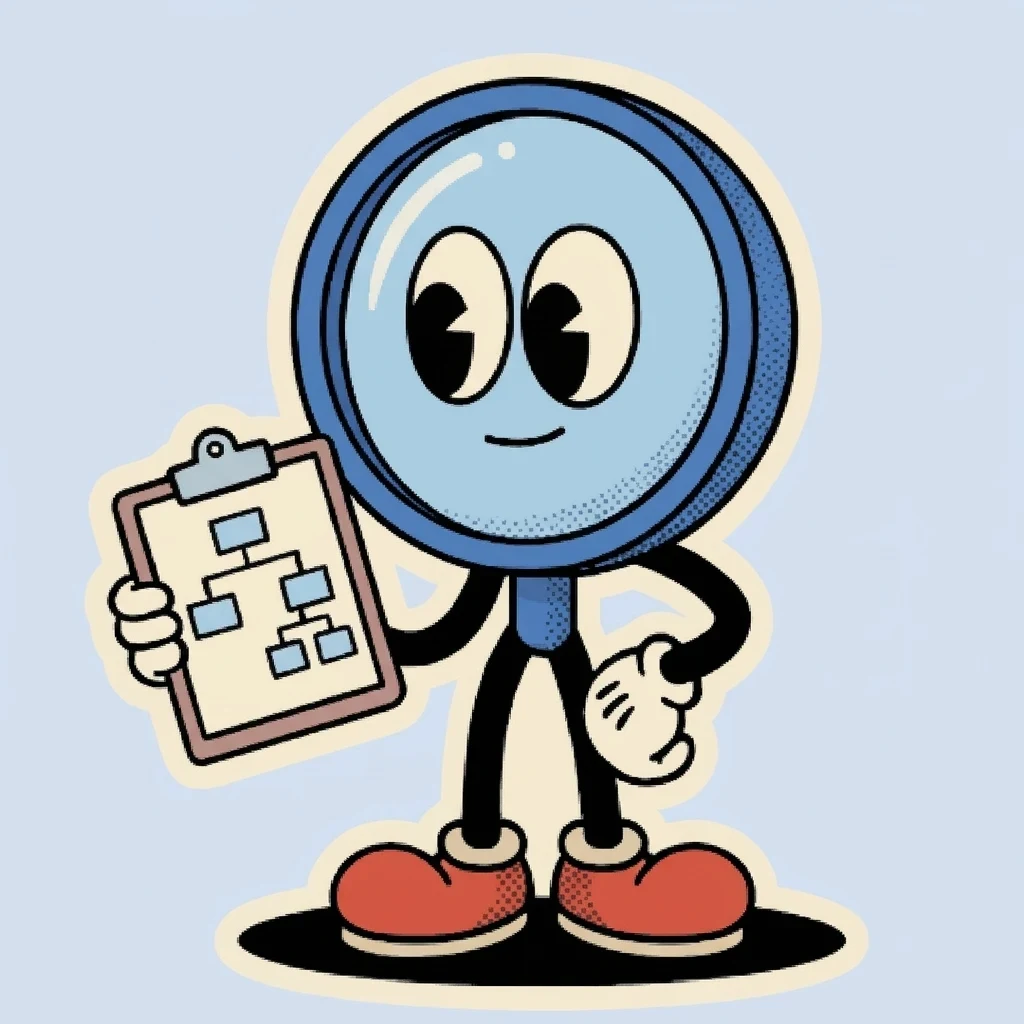
Agent · IA
The IA agent
Maps the structure: navigation, labels, what each page is for, and the paths to what people came for.

The findings
The Pin Crew
One pin per finding. What the agents find is grouped into 12 to 15 well-argued points, each pinned to the place people meet it.
3. How it runs

Six steps, three stops for you.
All it needs is the product: a URL, a store link, screens or the source code. It takes a quick look, then may ask a few simple follow-up questions.
- 01
Capture
Captures each page in scope, with the live values a review needs: prices, counts, fees.
- 02
Extract
Pulls the product’s brand and design system, so every document is styled in its own look.
- 03
Research
Benchmarks the category and the market, so proposals point to how it’s done well elsewhere.
- 04
Review
Three agents review the product on their own: UX walks the key tasks and notes where people hesitate or give up, UI checks hierarchy, type, colour and consistency, and IA maps the navigation, labels and paths.
- 05
Report
12 to 15 argued findings, each with marked screenshot evidence, a priority, why it matters and what to change, plus an IA analysis: navigation compared with competitors, the layout of each page type, and the paths people take to buy, with where they get stuck. Two independent checks verify every fact and the design before you see them.
You review
- 06
Mock
You approve what will change, then get the fix as a real page: current and proposed side by side. Numbered markers show each change, and each has a note saying what’s wrong now and what the change does.
You review
4. What you get

Three documents, in the product’s own design system.
Each one comes as a single self-contained file, and an index page ties them together.
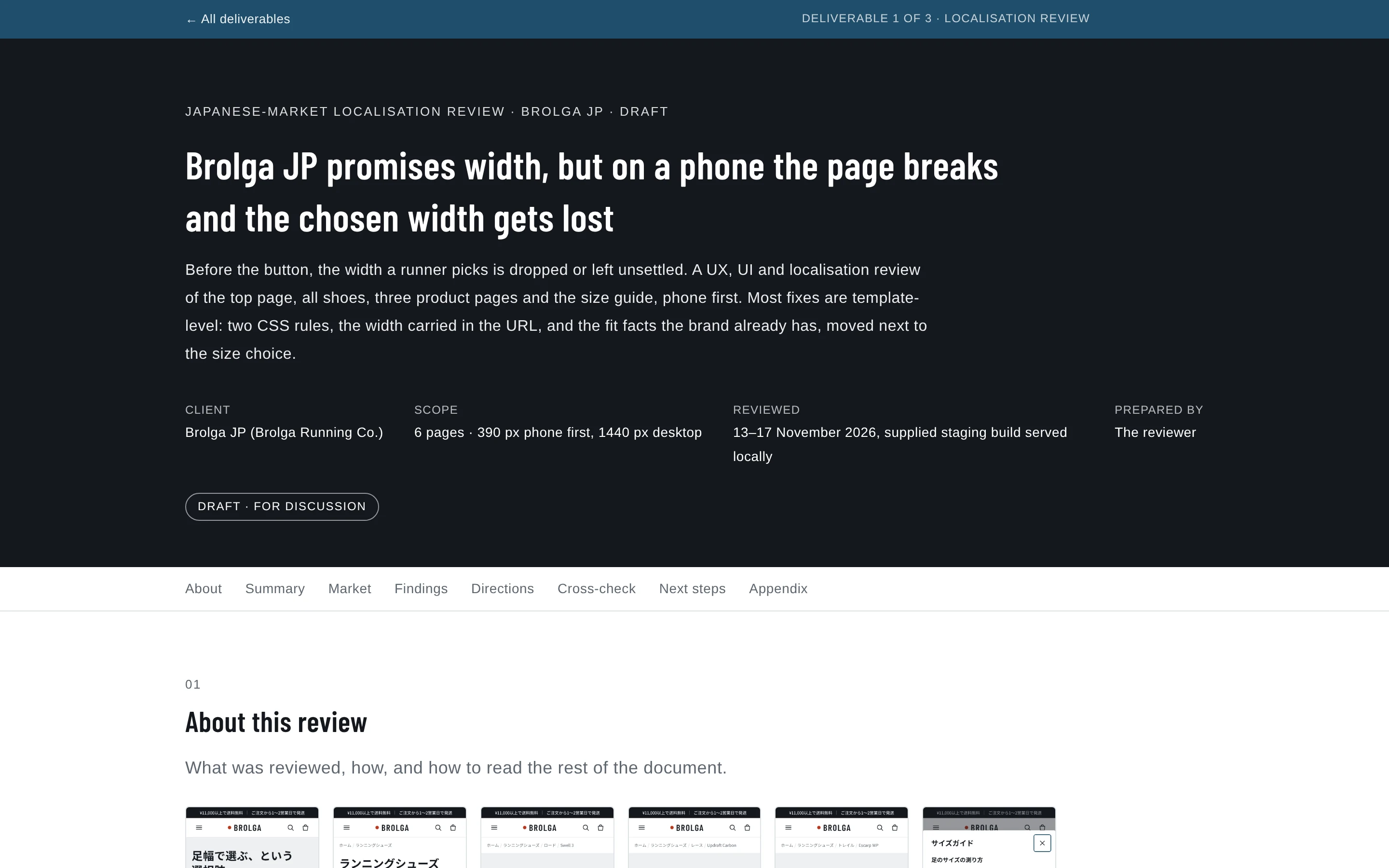
The review report
12 to 15 grouped findings, each with its evidence, why it matters and a concrete change. Smaller points go in a compact table.
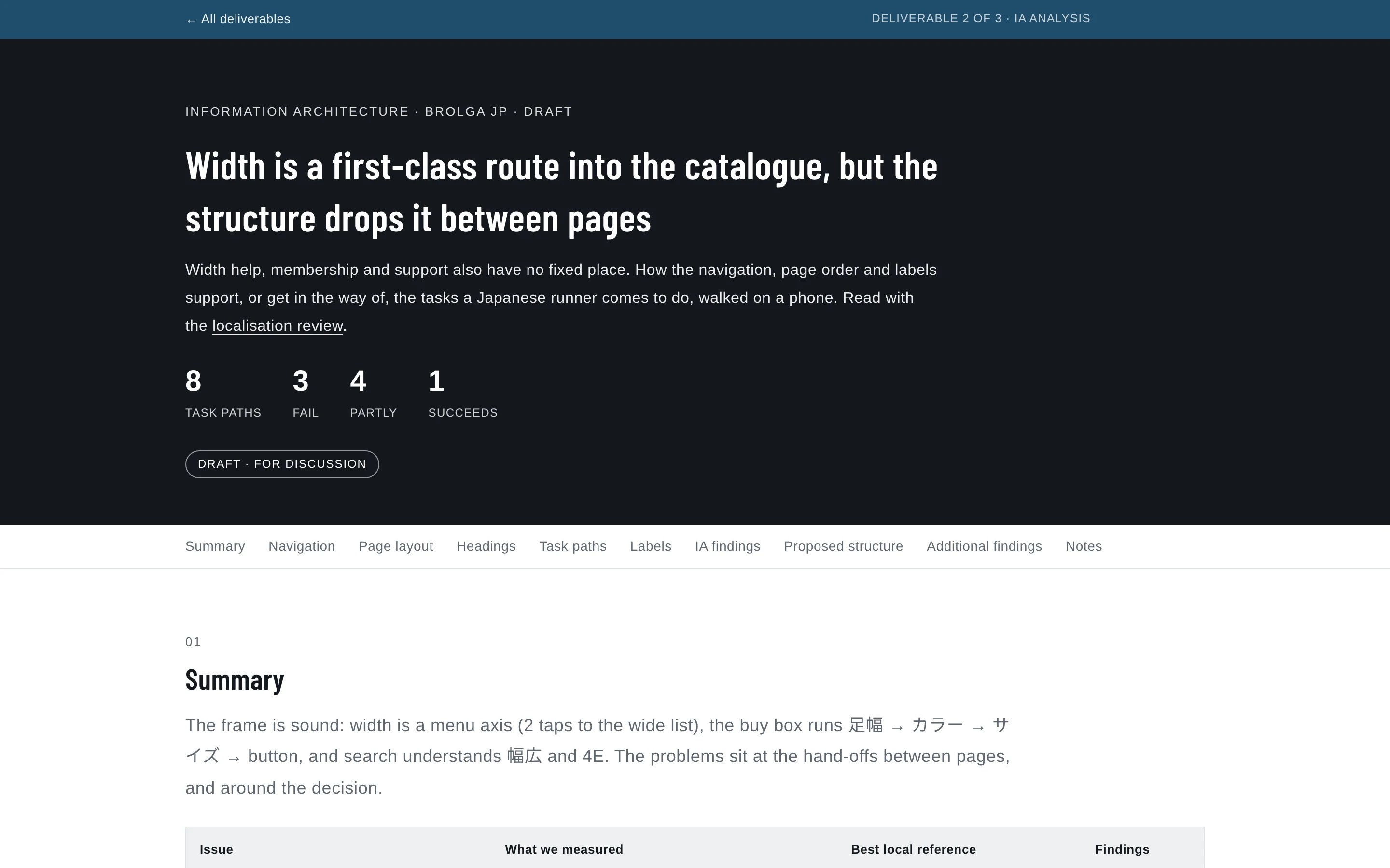
The IA analysis
Navigation compared with benchmarks, page layouts by type, heading structure, a label audit and the key task paths step by step.
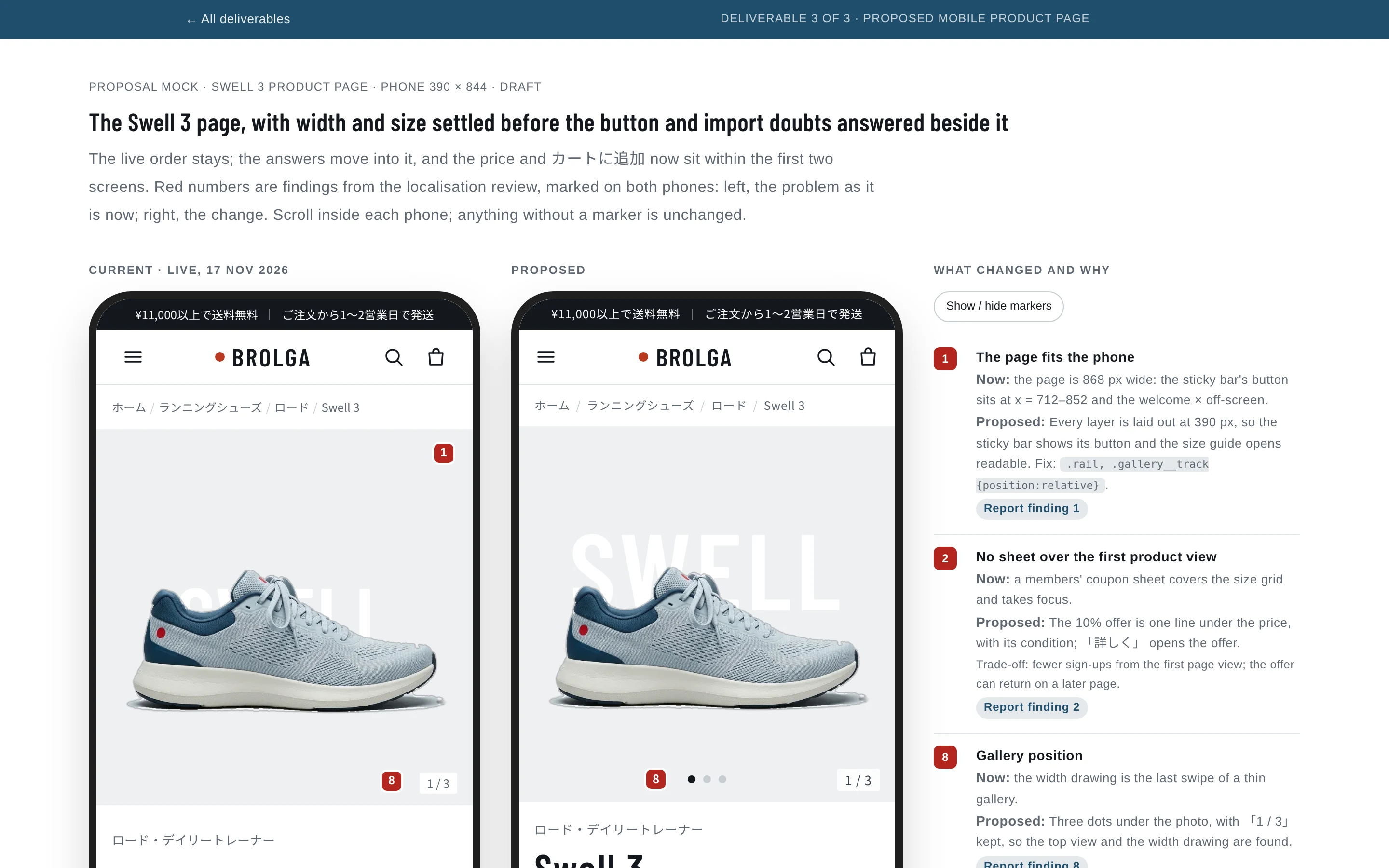
The mock
The current screen and the proposed one side by side, with a numbered marker on each change.
5. Current and proposed

Same number, both sides.
The final deliverable is a mock of the proposed improvements. Every change is numbered on both screens and sets out what changes, why, and how, backed by the evidence and research behind its report finding.
Scroll each phone, as in the real mock. The notes are the example’s own.


What each marker identifies
1. The page fits the phone
Now: the page is 868 px wide: the sticky bar's button sits at x = 712–852 and the welcome × off-screen.
Proposed: Every layer is laid out at 390 px, so the sticky bar shows its button and the size guide opens readable. Fix: .rail, .gallery__track {position:relative}.
Report finding 1
2. No sheet over the first product view
Now: a members' coupon sheet covers the size grid and takes focus.
Proposed: The 10% offer is one line under the price, with its condition; 「詳しく」 opens the offer.
Report finding 2
8. Gallery position
Now: the width drawing is the last swipe of a thin gallery.
Proposed: Three dots under the photo, with 「1 / 3」 kept, so the top view and the width drawing are found.
Report finding 8
5. The chosen width arrives selected
Now: every product page opens on 標準.
Proposed: From the wide list, ワイド is selected, named beside the product name, and the grid shows the wide stock (22.0 and 22.5 sold out, 27.5 low).
Report finding 5
4. Lines break between phrases
Now: Japanese text breaks mid-word, from the first screen.
Proposed: The lede breaks at phrase boundaries, not 「バラ/ンス」; the compare cells keep 「ロング走」 whole.
Report finding 4
6. Width help where width is chosen
Now: width help can't settle the width: 3E is in both ranges and there is no 足囲 table.
Proposed: 「足幅の選び方」 beside 足幅 opens the width guide (inset below the phone): the brand's outline drawing, a decisive rule for 3E, and a girth table to compare a measurement with.
Report finding 6
17. The low-stock dot explained
Now: the low-stock dot has no visible meaning.
Proposed: 「● 残りわずか」 beside the サイズ label gives the dot on 27.5 a visible meaning.
Report finding 17
7. Fit advice at the size choice
Now: fit advice is only in the closed スペック, below the button.
Proposed: One line between サイズ and the grid, from the spec's 「標準的なサイズ感」.
Report finding 7
3. Readable decision text
Now: reading text is 13 px and decision details 12 px.
Proposed: Lede 16 px; service lines, fit line and review bodies 15 px; the width sub-labels 13 px, so nothing on the decision path is under 13 px. The price and カートに追加 both sit within the first two screens.
Report finding 3
13. Ships from Japan, no customs
Now: 「国内倉庫から発送・関税なし」 is only in the FAQ.
Proposed: The delivery row leads with 「国内(千葉)の倉庫から…関税なし」, from the FAQ, and the free-shipping promise gets its ※.
Report finding 13
11. A route to membership
Now: the run-return needs membership, but there is no 会員登録 or login anywhere.
Proposed: The run-return keeps its membership and once-per-person conditions and gains 「会員について」, which opens the membership explanation.
Report finding 11
10. Payment at a glance
Now: no answer on 後払い, a text-only list, and the コンビニ fee away from the button.
Proposed: The four methods as chips (the client's real marks can replace them), with the ¥220 コンビニ fee and an explicit answer on 代引 and 後払い.
Report finding 10
18. Compare this model with its neighbours
Now: 「ほかのモデルと比べる」 shows a fixed four models.
Proposed: Swell 3 first and marked, beside the three closest road models; moved up to follow the service list; the first column stays put as the table scrolls.
Report finding 18
12. Reviews that answer fit
Now: 4 of 198 reviews shown, with no fit summary or filter.
Proposed: 標準/ワイド filters from the width every review already records, a サイズ感 bar (needs a one-tap fit question at review time), a route to all 198, and a source line. Shares and counts are client data.
Report finding 12
9. 税込 in the sticky bar
Now: the sticky bar drops 税込 once a size is chosen.
Proposed: Two lines: the selection, then 「¥18,700(税込)」 at 17 px.
Report finding 9
6. Limits

Honest limits.
AIspy supports a reviewer; it doesn’t replace one. It stops for you three times: after the report, after the mock spec, and after the mock. Expect one round of feedback on the mock.
Not a full accessibility audit. It checks contrast, text size, tap targets, alt text, headings and motion. It doesn’t walk the site with a screen reader or keyboard unless you ask.
AIspy never handles credentials. For logged-in areas, you sign in in the browser yourself.
It reviews what users see. With the source code, it runs the pages and reviews them as they render, the way the example’s local test site was reviewed. It reads the page code too, but to extract the brand and design system, not as a substitute for the rendered page.
7. Try it

Free and open on GitHub.
AIspy is an open skill pack, designed for Claude Code and usable with other AI agents too. Install it from GitHub, and a request can be as short as this:
Review https://example.com and propose improvements.Focus on mobile checkout. They’re launching in Japan, so include a localisation review.
Optional add-onLocalisation review, Japan first.