
1. AIspyを選ぶ理由
白紙のプロンプトから始めない、シニアレベルのレビュー。
UX・UI・IA(情報設計)を丁寧にレビューするには、すべてのページをキャプチャし、ブランドを読み解き、競合や市場と比べたうえで、指摘ごとに根拠を示す必要があります。AIに手早くレビューを頼むと、根拠の薄いありきたりな指摘が長く並ぶだけになりがちです。
AIspyは、このワークフロー全体をスキル、テンプレート、チェックとしてまとめたものです。実際のプロのレビューをもとにつくり、同じ水準になるまで検証を重ねたため、すべての指摘に根拠と理由があり、資料はレビュー対象のブランドで仕上がります。
身近にシニアデザイナーがいないプロダクトマネージャー、創業者、開発者、マーケターのためのツールです。レビューの出発点がほしいデザイナーや、AIエージェントを活用するチームにも使えます。
2. チーム

リーダーが1人、エージェントが3人、そしてピンたち。
AIspyはチームのリーダー、いわばデザインディレクターやプロダクトマネージャーです。下準備を自ら行い、3つのレビューエージェントを指揮します。エージェントは互いの判断に引きずられないようそれぞれ独立して動き、AIspyがその結果をレポートとモックにまとめます。

リーダー · ディレクター
AIspy
デザインディレクターやプロダクトマネージャーのような存在です。ページのキャプチャ、ブランドとデザインシステムの抽出、リサーチを自ら行い、3つのエージェントに指示を出してレビュー全体を進行します。そのうえで、それぞれの独立した指摘をレポートとモックにまとめます。

エージェント · UX
UXエージェント
ユーザーと同じように主要なタスクをたどり、迷う、止まる、あきらめる場面を記録します。
エージェント · UI
UIエージェント
情報の優先順位、文字、色、コントラスト、状態、一貫性といった細部を確認します。

エージェント · IA
IAエージェント
ナビゲーション、ラベル、各ページの役割、目的の情報にたどり着く道筋など、構造を整理します。

指摘
The Pin Crew
指摘ひとつにピンひとつ。エージェントの指摘を、根拠のある12〜15のポイントにまとめ、ユーザーがその問題に直面する場所にピンを立てます。
3. 進め方

6つのステップと、3回の確認。
必要なのはプロダクトだけです。URL、ストアのリンク、画面、またはソースコードがあれば始められます。ざっと確認したあと、必要に応じて簡単な質問をいくつかします。
- 01
Capture
対象ページをキャプチャし、価格、件数、手数料など、レビューに必要な実際の値も記録します。
- 02
Extract
レビュー対象のブランドとデザインシステムを抽出し、すべての資料をそのトーンで仕上げます。
- 03
Research
カテゴリや市場の事例をベンチマークし、優れた事例を根拠に提案できるようにします。
- 04
Review
3つのエージェントが、それぞれ独立してレビューします。UXは主要なタスクをたどって迷う場面やあきらめる場面を、UIは情報の優先順位、文字、色、一貫性を、IAはナビゲーション、ラベル、道筋を確認します。
- 05
Report
12〜15の指摘それぞれに、マーカー付きのスクリーンショット、優先度、重要な理由、変更内容を添え、IA分析(競合と比べたナビゲーション、ページタイプごとのレイアウト、購入までの道筋とつまずく場所)とあわせてまとめます。確認をお願いする前に、独立した2つのチェックで事実とデザインを検証します。
ここで確認
- 06
Mock
変更内容を承認してもらったうえで、改善案を実際のページとして作成します。現在と改善案を並べ、変更点ごとに番号つきのマーカーと、今の問題と変更の効果を説明する注記を付けます。
ここで確認
4. 成果物

レビュー対象のデザインシステムで仕上げる、3つの資料。
それぞれ1ファイルで完結し、インデックスページでまとめて見られます。
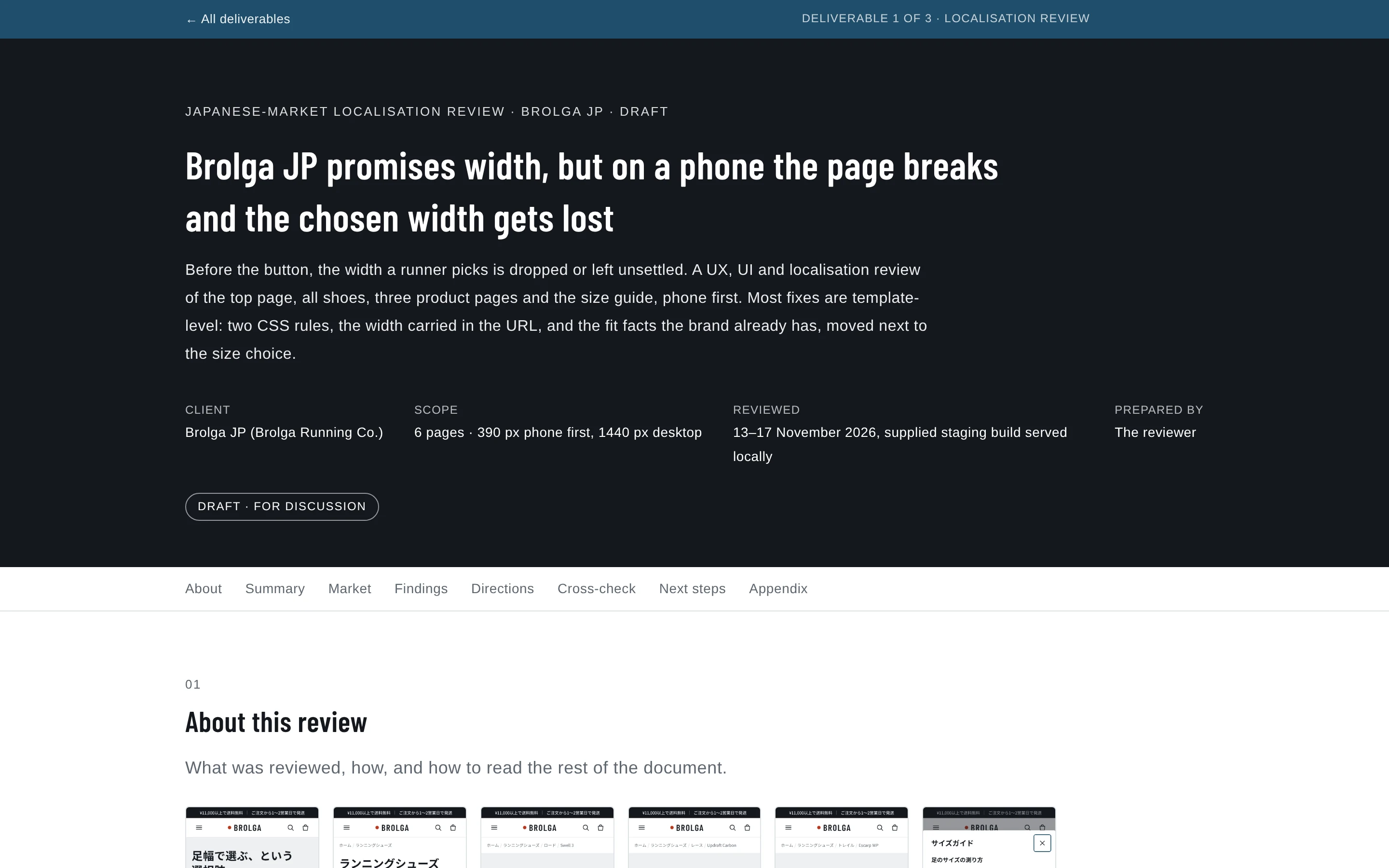
レビューレポート
12〜15にまとめた指摘それぞれに、根拠、重要な理由、具体的な変更案を添えます。細かな点はコンパクトな表にまとめます。
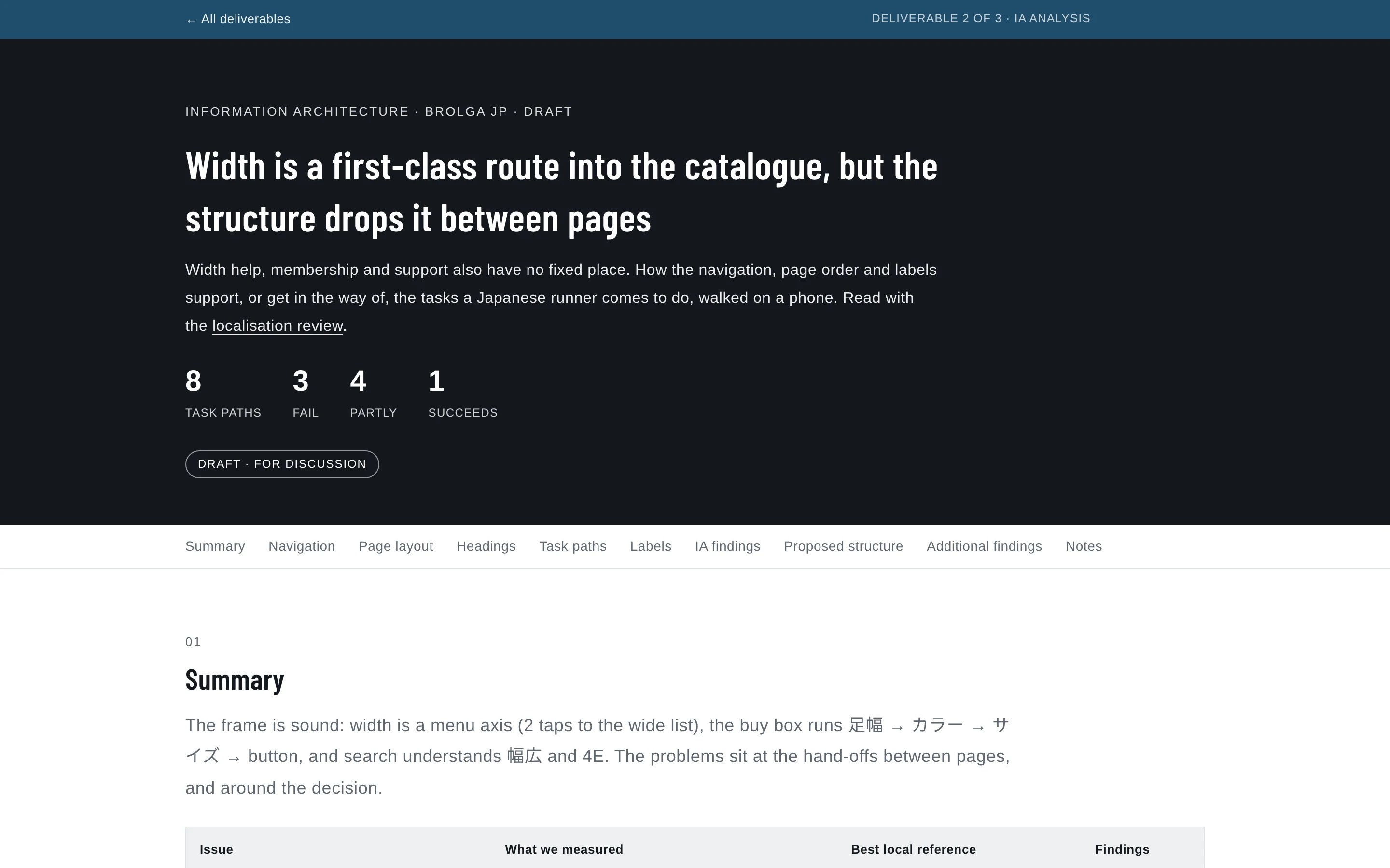
IA分
析 ベンチマークとのナビゲーション比較、ページタイプ別のレイアウト、見出し構造、ラベルの確認、主要タスクの道筋をステップごとにまとめます。
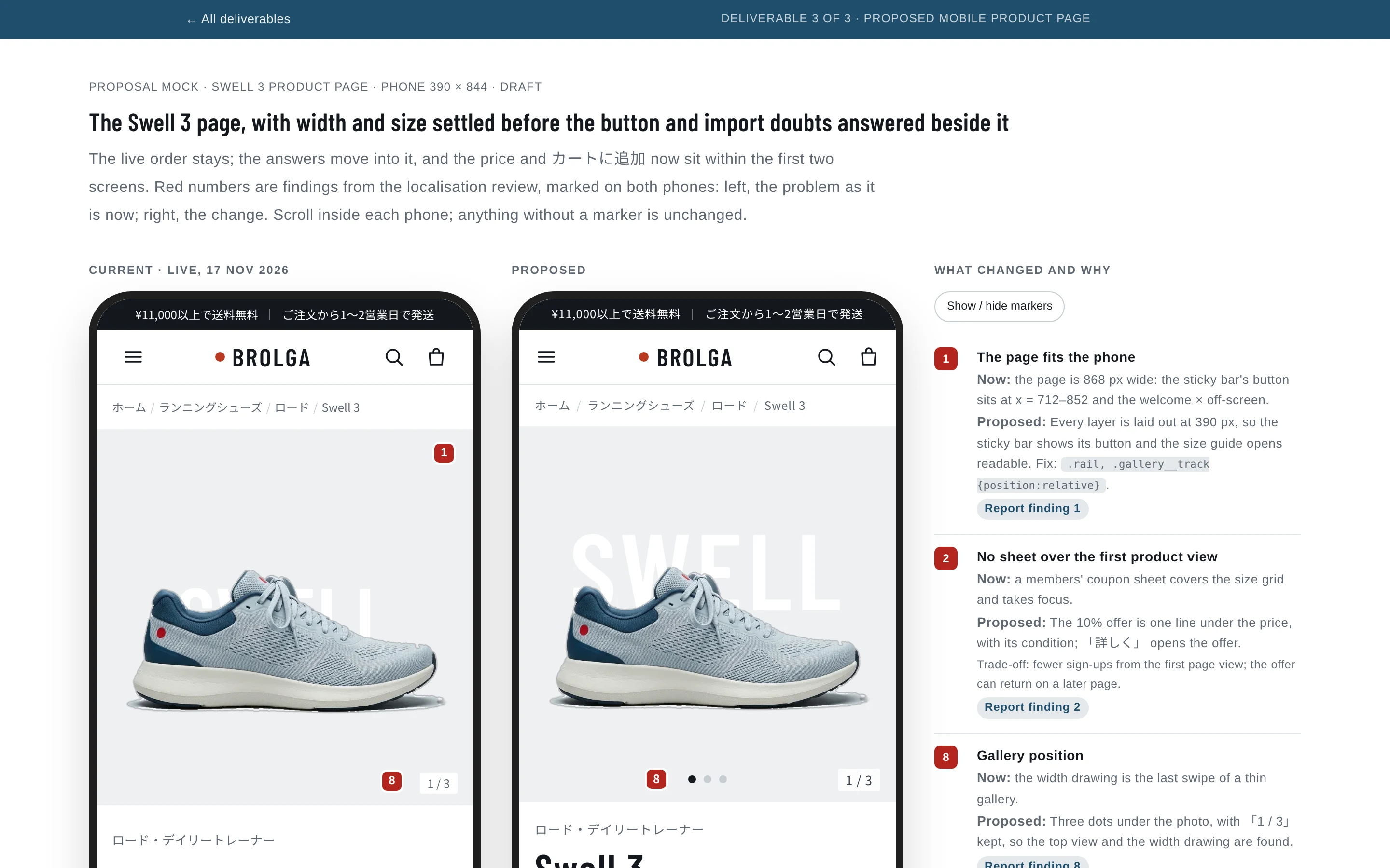
モック
現在の画面と改善案の画面を並べ、変更点ごとに番号つきのマーカーを付けます。
5. 現在と改善案

同じ番号を、両方の画面に。
最終的な成果物は、改善案のモックです。すべての変更点に両方の画面で番号を付け、何を、なぜ、どう変えるのかを、レポートの指摘の根拠とリサーチにもとづいて示します。
実際のモックと同じように、スマートフォンの中をスクロールできます。注記は事例のものをそのまま載せています(英語)。


各マーカーが示すもの
1. The page fits the phone
Now: the page is 868 px wide: the sticky bar's button sits at x = 712–852 and the welcome × off-screen.
Proposed: Every layer is laid out at 390 px, so the sticky bar shows its button and the size guide opens readable. Fix: .rail, .gallery__track {position:relative}.
Report finding 1
2. No sheet over the first product view
Now: a members' coupon sheet covers the size grid and takes focus.
Proposed: The 10% offer is one line under the price, with its condition; 「詳しく」 opens the offer.
Report finding 2
8. Gallery position
Now: the width drawing is the last swipe of a thin gallery.
Proposed: Three dots under the photo, with 「1 / 3」 kept, so the top view and the width drawing are found.
Report finding 8
5. The chosen width arrives selected
Now: every product page opens on 標準.
Proposed: From the wide list, ワイド is selected, named beside the product name, and the grid shows the wide stock (22.0 and 22.5 sold out, 27.5 low).
Report finding 5
4. Lines break between phrases
Now: Japanese text breaks mid-word, from the first screen.
Proposed: The lede breaks at phrase boundaries, not 「バラ/ンス」; the compare cells keep 「ロング走」 whole.
Report finding 4
6. Width help where width is chosen
Now: width help can't settle the width: 3E is in both ranges and there is no 足囲 table.
Proposed: 「足幅の選び方」 beside 足幅 opens the width guide (inset below the phone): the brand's outline drawing, a decisive rule for 3E, and a girth table to compare a measurement with.
Report finding 6
17. The low-stock dot explained
Now: the low-stock dot has no visible meaning.
Proposed: 「● 残りわずか」 beside the サイズ label gives the dot on 27.5 a visible meaning.
Report finding 17
7. Fit advice at the size choice
Now: fit advice is only in the closed スペック, below the button.
Proposed: One line between サイズ and the grid, from the spec's 「標準的なサイズ感」.
Report finding 7
3. Readable decision text
Now: reading text is 13 px and decision details 12 px.
Proposed: Lede 16 px; service lines, fit line and review bodies 15 px; the width sub-labels 13 px, so nothing on the decision path is under 13 px. The price and カートに追加 both sit within the first two screens.
Report finding 3
13. Ships from Japan, no customs
Now: 「国内倉庫から発送・関税なし」 is only in the FAQ.
Proposed: The delivery row leads with 「国内(千葉)の倉庫から…関税なし」, from the FAQ, and the free-shipping promise gets its ※.
Report finding 13
11. A route to membership
Now: the run-return needs membership, but there is no 会員登録 or login anywhere.
Proposed: The run-return keeps its membership and once-per-person conditions and gains 「会員について」, which opens the membership explanation.
Report finding 11
10. Payment at a glance
Now: no answer on 後払い, a text-only list, and the コンビニ fee away from the button.
Proposed: The four methods as chips (the client's real marks can replace them), with the ¥220 コンビニ fee and an explicit answer on 代引 and 後払い.
Report finding 10
18. Compare this model with its neighbours
Now: 「ほかのモデルと比べる」 shows a fixed four models.
Proposed: Swell 3 first and marked, beside the three closest road models; moved up to follow the service list; the first column stays put as the table scrolls.
Report finding 18
12. Reviews that answer fit
Now: 4 of 198 reviews shown, with no fit summary or filter.
Proposed: 標準/ワイド filters from the width every review already records, a サイズ感 bar (needs a one-tap fit question at review time), a route to all 198, and a source line. Shares and counts are client data.
Report finding 12
9. 税込 in the sticky bar
Now: the sticky bar drops 税込 once a size is chosen.
Proposed: Two lines: the selection, then 「¥18,700(税込)」 at 17 px.
Report finding 9
6. できないこと

できないことも、正直に。
レビュアーの
代わりではなく、 レポートのあと、モックの仕様のあと、モックのあとの3回、手を止めて確認をお願いします。モックへのフィードバックは1回いただく想定です。支える ための ものです。 アクセシビリティの
完全な コントラスト、文字サイズ、タップ領域、代替テキスト、見出し、動きは確認しますが、依頼がない限り、スクリーンリーダーやキーボードだけでの操作確認は行いません。監査ではありません。 ログイン情報は
扱いません。 ログインが必要な画面は、ご自身でブラウザからログインしてください。ユーザーが
見る ソースコードがある場合は、ローカルでページを立ち上げ、実際に表示された状態でレビューします(事例のテストサイトも同じ方法でレビューしています)。コードも読みますが、それはブランドとデザインシステムを抽出するためで、表示されたページの代わりにはしません。ものを レビューします。
7. 使ってみる

GitHubで、無料で公開中です。
AIspyは、Claude Code向けに設計されたオープンなスキルパックで、ほかのAIエージェントでも使えます。GitHubから導入すれば、依頼はこれくらい短くても大丈夫です。
Review https://example.com and propose improvements.Focus on mobile checkout. They’re launching in Japan, so include a localisation review.
オプションローカライズレビュー(まずは日本向け)